The tl;dr:
At Nylas our API is the core of our product, the core of our business, and the primary interface we have with our customers. As a result it’s very important for us to keep the API fast. Effectively speeding up the API is an exercise in diagnosis, profiling, and monitoring that requires good tools, good visualizations, and focus. This blogpost will walk through the techniques we use to hit our performance goals, as well as give specific examples of how these techniques are applied.
Set a Clear and Measurable Goal
Our current API goal is to have a P90 total request time < 500ms
All goals have nuance to them. It’s important to explicitly define those nuances as they influence how you analyze data.
This goal is designed to be compact. It easily fits on a single sheet of paper at the office for all to see, while still providing a clear and precise target to hit. That brevity hides a fair amount of complexity that we nonetheless need to consider when deciding if we’ve hit it.
First of all, “total request time” needs to be elaborated a bit more. The Nylas API has many different endpoints. Each of those endpoints have different performance considerations and can have very different usage patterns. It’s unproductive to have dozens of mini-goals, one for each endpoint, so we have to balance where to draw the line and exclude a couple of API endpoints in this metric. For example, we have a long polling endpoint that’s always open for 30 seconds at a time. The email /send endpoint’s performance is a function of the upstream end-user’s servers and not helpful when focusing on performance knobs we control. In addition, the /health endpoint is trivial and skews averages.
“P90” is a way to quantify our slowest API requests. It shorthand for the “90th percentile”. In our case it means that 9 out of every 10 requests take less than ½ a second. We furthermore run that calculation once every 15 minutes to smooth out intermittent flutter.
Finally, 500ms is measured as liberally as we can at the omniproxy network level. If we only looked at application code, we might miss network issues and other bottlenecks. However, since we only serve from AWS US East, we only include responses within a certain physical distance from the data center to normalize out speed-of-light times.
Measuring with Honeycomb
Knowing exactly what’s wrong is the hard part. Humans are incredible pattern detectors, but we have to be looking at something with patterns to do this. Quickly getting meaningful patterns out of reams of data is critical to effective performance tuning on a system like the Nylas API.
The tool that makes the most impact on this problem is Honeycomb. The speed of their interface is key. It allows you to visualize data with different sort, filter, and grouping criteria with only a couple of keystrokes. This speed is critical because finding the right patterns of data requires pursuing dozens of hunches in rapid succession. The mental energy spent creating a visualization from scratch is energy diverted from actually diagnosing the problem at hand.
The correct visualizations are also important. We actively use a heatmap to get quick overviews of how a particular endpoint is doing. In one visualization I can not only see which endpoints are the slowest, but I can also see how volatile the response times are. Consistently slow vs erratically slow imply different problems that require different debugging techniques.

This is the Honeycomb Heatmap. We are looking at our 5 slowest API endpoints broken down
by endpoint. By simply hovering over an endpoint we can see the behaviors of each endpoint.
The top graph is the P90 per endpoint. The middle is a Heatmap show individual samplings
colored by frequency. The bottom is the count of requests.
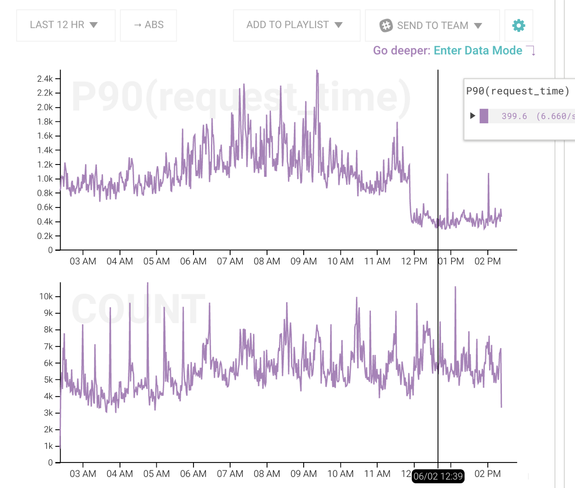
This is the Honeycomb graph demonstrating a deploy that dramatically improved performance.
The top graph is the P90 request time plot.
It’s also important to remember that when measuring things like a high-traffic API, there are almost never any absolutes. Everything is probabilistic and should be treated as such.
The first measurement phase is all about focusing effort. No performance project has limitless resources and silver bullets rarely exist; however, there will usually be an outlier that rises out of the noise. These are the phases we’ll dig into next.
Profiling with Nylas Perftools
Once we find a source of slowness, it’s time to dive deeper into what might be going on.
The goal of profiling is to narrow the problem down to at best a reproducible scenario, or at least a function-level place to focus on auditing and fixing.
There are a couple ways we can go about profiling. The first is via standard code profiling and step-by-step debugging. This method is extremely precise but tends to rely on deterministic isolated code. The second is via statistical profiling on actual production machines. This method is harder to get set up and is less interactive, but is far better at diagnosing what’s actually going on.
When people first think about profiling in Python the first Google results are cProfile. We use that a little bit, but it’s only effective if the problem can be reproduced locally and in isolation. cProfile is side effect heavy and bad for production environments. Furthermore, the default output of this profiler is a very large bunch of text. While this is great for data portability and getting precise numbers, it’s not good for quickly grasping the gist of what’s going on. We enjoy using SnakeViz, which provides the flame and circle charts for the profiling data. Here again, visualization matters. Your pattern recognizing abilities can immediately tell you the characteristic of the trace far faster than it can process a table of numbers. That extra time means you can try out more hunches and get closer to the real problem faster.
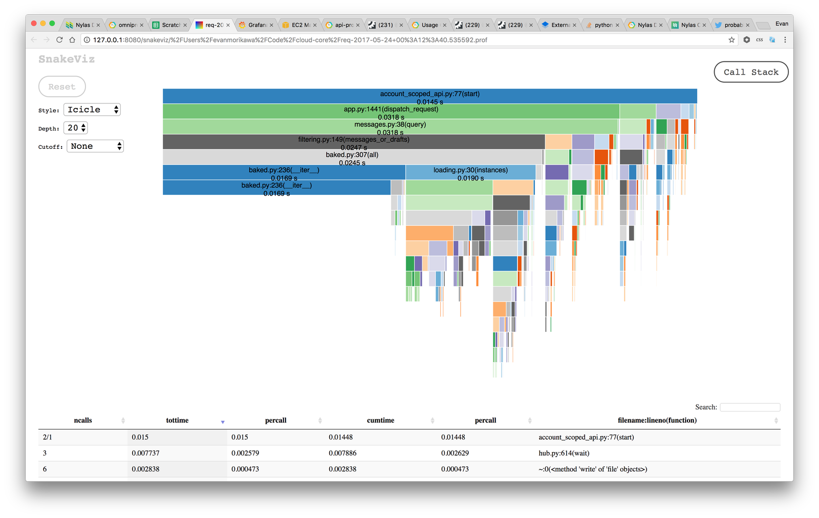
This is an output of SnakeViz. Despite the caveats of local testing,
it’s far easier to see the results of cProfile than the default text dump.
For a large API, standard code profiling isn’t usually a source of answers. Many issues happen due to load, network, or other random and rare events that are not easy to reproduce locally under a single controlled environment that profilers can handle.
Instead we resort to a statistical profiler of our own design called nylas-perftools We have written extensively about this awesome tool. Check it out! In a nutshell, this will sample the stack periodically and give you a flame chart that represents not only a single linear code path, but rather a statistical sampling of what the machine was doing over time. This can tell us quickly and visually if there are slow areas that show up under a real production load.
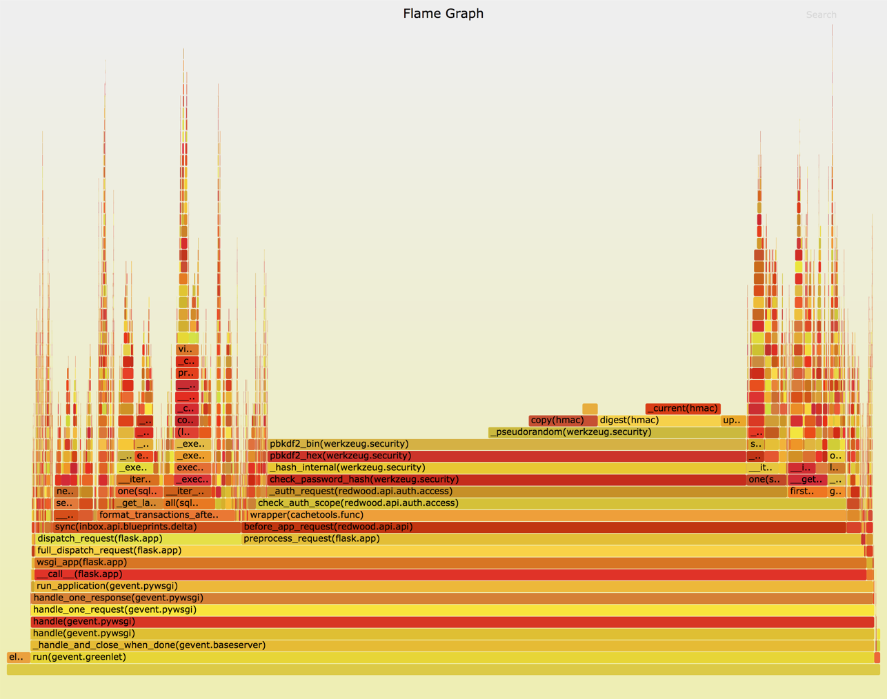
This is the output of nylas-perftools. In this example it’s immediately obvious
there is a function taking a majority of the time. It’s important to note that
unlike the cProfile SnakeViz graph, this is a statistical representation of an actively running production system.
Fixing & Validating
If the measuring and profiling tools have done their jobs, the actual code fix tends to be the easy part. In the best case a reproducible issue will be immediately and obviously faster with a couple lines of code. More commonly, fixes tend to be a bit speculative, driven by very strong evidence-based hunches that come from profiling and measuring steps.
Speculative fixes are fine, but they require a validation step that can only be found in the previous efforts of measuring and profiling tools. This is why it’s also important to make sure that profiles and graphs are reproducible and easy to get back to. Saving a profiled code in a commit, having a ready-to-go debug build artifact, or saving links to graphs all help quickly reproduce a previous measurement.
Monitoring & Alerting
A deployed fix is not the end of the performance battle. Performance is an ongoing endeavor and must be treated as such.
We use Honeycomb’s alerting feature to let us know when our main P90 < 500ms goal exceeds its threshold. This automatically goes to PagerDuty and notifies the on call engineer. We also use Graphite, and Sensu to alert us via PagerDuty for other alerts.
API performance is a slightly different beast than something like a server health check. Occasionally the alert may go off and we’ll see a huge spike indicative of a bad deploy or something else momentarily wrong with the API. More likely, code and cruft builds over time and performance begins to degrade slowly. When this happens, our performance alert starts to flutter on and off, which is a really strong sign it’s time to repeat this whole process again.
What I’ve outlined here is fairly straightforward process similar to many debugging processes. The key is bringing effective tooling, good visualizations, and clear focus to a notoriously difficult process.
 Email and Contacts API
  Calendar API & Scheduler
  Notetaker API
  Agent Accounts


